Week 15 (Final Exam)

To Dr Jamal : 

A billion thanks to you dr because teach me this subject. I had learn a lots of thing form you dr in this subject. I'm very enjoy during your class session. Hope will see u soon dr..sob2...sedih la plak..sob3..Segala jasa-jasa dr akan dikenang...insyaallah...Terimalah pantun ni, dari saya..khas buat buat Dr Jamal... ehem..ehem..eheeemmmmm....
 
 
Pohon selasih di dalam kolam,
Anak haruan berenang-renang,
Terima kasih saya ucapkan,
Budi Dr jamal menjadi kenangan.
 
 
Terbang selisih siburung kedidi,
Terbang berduyun di waktu pagi,
Terima kasih daun keladi,
di lain tahun berjumpa lagi.
 
 
Dua tiga kucing berlari.
Mana nak sama si kucing belang,
Dua tiga boleh kucari, 
Mana nak sama Dr Jamal seorang.


Terima kasih dr..terima kasih sbb ajar saya...:)


P/s to Dr Jamal : Dr..saya nak A...hik3..tp kalo dr nk bg A+ pun xpe..blh gak tuh 
                             dr...hik3..


Subject: Web Based and Multimedia Development

Date : 9 May 2011

Venue : C14-412

Time : 3-6pm


  • Digg
  • Del.icio.us
  • StumbleUpon
  • Reddit
  • RSS

Week 14 ( Study Week)

 
Study...study...study...study...

  • Digg
  • Del.icio.us
  • StumbleUpon
  • Reddit
  • RSS

Week 13 ( Project Presentation )

:: INFORMATION OF WEBSITE PROJECT::

Subject : Web Based Multimedia Development (MPT 1393)
Title of Project :
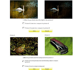
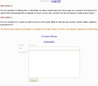
Taking Great Pictures
Course :
Master in Education (Educational Technology)
Group Member: -The Touch-
Noor Hidayah Che Lah MP101013
Siti Khadijah Mohamad MP101176
Syifak Izhar Hisham MP092218


PROJECT SUMMARY
 
This website was develop based on the criteria belows :

Objectives :
Our main website objective would be to help students who are the beginner photographer by delivering and sharing tips and rules to get best pictures.We would like to create a website which:
            a. Supports active learning.
            b. can be cognitively challenging by introducing the learner to new ideas, concepts 
                or  skills.
 
Subtopics :
This website contains of four main subtopics :
1.General Tips for Shooting Techniques 2.People and Animal Shooting Techniques Tips
3.Landscape and Nature Shooting Techniques
4.Sport and Action Shooting Techniques

Target User :
Our target group for this project is secondary schools students who are beginners in photography.

Learning and Teaching Strategy :
We are using task based learning in this website. We provide the user with a lots of notes,information, examples and we are going to help their understanding with encourage them to contribute with the all of interesting activities, quizes and questions.


EXAMPLES OF PRINT SCREEN


This is our homepage.


This note very attractive because using the flash and give user to control it.


SELF REVIEW


We already try our best and  give  a  very good effort to finish this project. I hope we will get the good marks for it.
 
 
Polling session


  • Digg
  • Del.icio.us
  • StumbleUpon
  • Reddit
  • RSS

Week 12 ( Web Testing & Evaluation)

Testing and Evaluating our own site can help us to spot problems and make appropriate changes.Other than that, It helps to have somebody else evaluate and test the site for us, but we can probably gain some benefit even if we go through the procedure our self.


  • Conducting a thorough web site inspection, utilizes self-testing and group testing.
  • Sometimes, also known as Alpha/Beta testing, Peer testing, Focus group testing.


The first phase of testing is the self-test 

to ensure the functionality of the following features and elements:
  • Page display
  • Image display
  •  Navigation elements
  •  Interactive & dynamic elements
  •  Internal links
  •  External links
  • After conducting the self-testing, correct any identified problems.

2nd phase: Group Testing'

  • Involves recruiting a small group of people representative of your audience to test your website.
  • Give you better ideas of how your audience will respond to your website.
  • If possible; be present when they test, but do not instruct or explain.
  • Observe their experience as they explore your website.
  • What kind of problems and obstacles do they face

  • What could improve the website  

  • What should be added or deleted

After observing the testing, ask the individuals to express their candid opinions about their
experience: Ask questions such as:

  • Did they find the website interesting and easy to use.
  • What helped or hampered navigation


Types of Testing


Alpha Testing: 
Testing a software/website product which is not the final version. This website does not have to necessarily contain the full functionality required for a website however core functionality to accept input an generate

Beta Testing:
Beta Testing is last stage of testing where a product is sent outside the company or
offer the product for free trial download/use.

Several kinds of testing are appropriate for websites, including the following:

�� functionality
Functionality testing refers to the testing of programmatic features and is most appropriate
for sites of higher complexity that contain features such as database access, dynamic page generation, and Java applets, namely features that require actual programming (rather than
HTML page building).


�� layout testing
Layout testing refers to the ability of the website page layout to accommodate various user
browser and hardware display configurations


�� load testing
Testing such capabilities is called load testing.Load testing simulates the anticipated stress of the actual site usage to see if the system has any weak links.


�� link testing
The testing of links from your site to other Web pages is called link testing.


�� usability testing
 Usability is a quality attribute that assesses how easy user interfaces are to use.The word "usability" also refers to methods for improving ease-of-use during the design process.


Level of Evaluation

 
��Formative Evaluation
  •  Identification of lesson features that need modification
  •  Ongoing process
  •  Lesson improvement is the goal

��Summative Evaluation 
  • Signature authority
  • Not used for modification
  • Usually at the end of project phase
  • Used for purchase or adoption decisions


Web Evaluation Tools
  • Observation, interviews (Structured/Non Structured)
  • Surveys/Questionnaires Focus Groups Analysis
  • Questionnaires, Groups, Analysis,
  • Reports, and Dialogue with Users
  • Form, Checklist or Rubric

SELF REVIEW


Web testing is very important because to identify and fix any problems before publishing to avoid any embarrassment or credibility loss with our potential user. Without the testing, we run the risk of appearing unprofessional, and we may even alienate potential users if problem are not discovered until the sites is live on the web. There are two phases of testing. First phase testing is the self-test which is the developer to ensure the functionality of some features and elements in the website. The second phase of testing is group testing which is representing our audience to test our website. There are also two types of testing which are alpa testing and beta testing.


Evaluate is also important for our website. there are two types levels of web evaluation which are formative and summative evaluation. Formative evolution means that, the developer of the website is evaluate the website. While the summative evaluation is the other person which is the user evaluate the website or the audience of the website by themselves.


  • Digg
  • Del.icio.us
  • StumbleUpon
  • Reddit
  • RSS

Week 11 ( Prototype of Presentation )

In this week we are going to present our website which is finished 40%. This is including some of the interaction and navigation part.


All this are the some of the examples of prototype that we are presented during this week.


SELF REVIEW


In this week, we only present prototype of our website. But only the 40% of the our website. There are many thing need to be organize and link for the website. There are also some parts need to be develop for our website. However, I am really happy when Dr. Jamal love our website template or layout design. So that, we do not need to change it and just proceed to finish the rest part of the website.

  • Digg
  • Del.icio.us
  • StumbleUpon
  • Reddit
  • RSS

Week 9 & Week 10

In these two week, We spend most of our time to develop our website. We separate the task and every team member do their work with very well. We try our best to finish our website because we are going to present it as 40% of finished project.


SELF REVIEW

Team working and team spirit is  very important when working on developing a website. In developing our project, my group member works very well and we support each others. Each individual is working hard to finish this project. The cooperation and collaboration from my team mates make me fell very motivated in doing this project. I am really appreciated both of them.


  • Digg
  • Del.icio.us
  • StumbleUpon
  • Reddit
  • RSS

Week 8 ( Visual Design)

Visual Design is about  planning how our web site will look. We design the interface of our website.

There are several things need to be considered when visualizing our Web Site which are :
  • What colors will look good together on our site?
  • What fonts or styles you will use for the written part of your web pages?

  • What graphics and multimedia effects are needed?
  • How will all of these elements be combined or arrange into an attractive layout?

Elements of User Interface

  • A background that reflects the theme.
  • Colours or Images
  • Foreground elements that reflect the theme.
  • Content and Links (title, headings, sub headings,body text, illustrations, captions)
  • Other elements that support the theme.
  • Text, images, buttons, navigation bars, animation,video, etc.
  • Typography
  •  Keep it simple


General Issues in visual design :

• Limit number of fonts per page and per site
• Use the same fonts consistently throughout the site

Make good font choices :

• Sans serif vs. serif ?
• Commonly installed fonts
• Mood
• Readability


General application user interface guidelines: 


  • Always use cute icons, buttons, and graphics. Everyone loves big red hearts, pink bunnies, and yellow smily faces.

    • Don't be afraid to experiment with colors!

      • Your application should play fun sounds while operating to keep the users entertained.

        • Never, ever, under any circumstance use the OS-native graphical controls or widgets. Users get bored of the same old buttons, text boxes, and stuff.

          • When possible, disable window management and use unusual, oddly placed graphics for the windowing functions such as the window close option.

            • When writing your own controls or widgets, make absolutely sure they look and feel nothing like the OS-native widgets or anything else the user might expect. Otherwise you might accidentally make the user think that your application is actually designed for their OS.

              • Use your own creative ideas on how a "save as" dialog should look and work. Built in ones are always too limiting.

                • It is important that the user should never be able to tell the difference between a checked and unchecked check box or option box.

                  • Always use obscure or poorly drawn graphics for your tool bar buttons, and never put text on them.

                    • Avoid including a preferences or options dialog. Instead, let the user use the standard OS provided text editor or an editor of their choosing to edit text configuration files. .

                      • Users need time to think about what they are doing and get coffee. Your application should always take at least 5 minutes to load even on the fastest available computer.

                        • Make sure an accidental double-click on a single-click item does something really nasty or unexpected.

                          • Tool tips are the perfect way to display critical information.

                            • To get the most screen space, force your application to always run maximized.

                              • Always make the default positions of floating properties windows cover something important.

                                • Use the most exotic fonts you can find.

                                  • Your application's user interface should be flexible and customizable to the point where if the user accidentally sneezes on the mouse or keyboard they will have to spend the next half an hour setting things back.

                                    • Let a 5-year old draw your graphics, including your corporate logo.

                                      • File browsing dialogs are not needed, users can easily remember and type in long file paths.

                                        • Design your application so it requires the user to set their tiny monitor to 10512 X 7430.

                                          • Always crash at a critical step and then display a fake apology to the user.

                                            • It is a mistake to make use of application hooks in the native desktop environment such as new file templates, file associations, or program menu icons.

                                              • The exception to the above is placing icons in the system tray. Place as many icons as you can in the system tray and make sure that the user can not remove them.

                                                • If your program implements keyboard shortcuts be original and make them completely different from any other applications.

                                                  • Rent extra UI space in your application out for advertising. Advertising benefits the users and your wallet.

                                                    • Never underestimate the power of nudity.

                                                      • Don't forget to embed a hidden video game as an "easter egg".

                                                      SELF REVIEW


                                                      Visual design is about our website interface. How the templates and layout of the website look like. In this phase, we are going to planning on how our website is will look. This including the combination color that we used for our website, the font style for written part of pages, graphic and multimedia effects are needed, and how will all the elements be combined or arrange into an attractive layout. All those thing are very important for the visual design. Other than that, to make sure our website is very good in interface, there are some guidelines that we need to follow in order to produce a good website.

                                                        • Digg
                                                        • Del.icio.us
                                                        • StumbleUpon
                                                        • Reddit
                                                        • RSS

                                                        Week 7 ( Interaction Design)

                                                        Commonly the Web is used for retrieving information, and there is very little in the way of interaction between users.  Information transfer over the Web is mostly one way, from the Webmaster, to the reader.  There are a few techniques to make the Web more interactive.

                                                        One method is to add a section to the web site that gives people a form that they can fill in with appropriate information, and then submit it.  These can be used for email feedback, for entry into guest books that appear on the page, as general comment forms that get saved into a database, or as more interactive things such as polls and visible comments on documents.

                                                        Another method of making the Web more interactive is by setting up customisation features for users.  This can be done by storing information about how the user wants information presented to them, what information they want presented to them, and also whether they want to be alerted to new or changing information, for example being alerted by email when a web page changes.

                                                        Principles for good navigation design

                                                        A site must:
                                                        1. Let me know where I am at all times
                                                        2. Clearly differentiate hyperlinks from content
                                                        3. Let me know clearly where I can go from here
                                                        4. Let me see where I’ve already been
                                                        5. Make it obvious what to do to get somewhere
                                                        6. Indicate what clicking a link will do


                                                        1. Let me know where I am at all times

                                                        ‘Signposting’ is part of navigation (how can you navigate somewhere if you don’t know where you’re starting from). Clear signposting is always important, to let people know where in the site they are, down to the page level (particularly when you consider that someone could be entering via an unusual link or search engine result).

                                                        Where navigation includes “where you are now”, it must be clearly indicated. The WDFS side navigation differentiates between “here” nav and “there” nav by showing “here” in black text on a grey background with no hyperlink (even the presence of a hyperlink suggests it’s “there”).
                                                        Note: Tabs naturally show “here” from “there”. 


                                                        2. Clearly differentiate hyperlinks from content

                                                        When navigation is apart from content, differentiate through complete physically separation, grouping and/or style from content.

                                                        When links are within content, you have to use style to differentiate. Conventional blue, underlined style with distinct ‘hover’, ‘active’ and ‘visited’ colours work really well. It has become generally acceptable to exclude the underline from links, although I strongly recommend keeping text hyperlinks in blue when on a white/grey background.


                                                        3. Let me know clearly where I can go from here

                                                        It must be obvious at a glance where I can go from here. That means that hyperlinks must be clearly distinguishable from content (see previous principle).


                                                        4. Let me see where I’ve already been

                                                        Being able to see pages you’ve already visited helps you to filter where you might want go now. It also helps you understand where you are in relation to where you’ve been.
                                                        HTML differentiates between unvisited and visited links by default. The standard colours work very well because they are conventional and easily recognised. If the designer must change the default link colour settings, they *must* provide alternatives that clearly differentiate visited and unvisited links. If tempted to change link colours because of your content’s background colour, think whether the background colour is really that important. Would white be a better solution?


                                                        5. Make it obvious what to do to get somewhere

                                                        Once a user knows where they can go, they need to know how to get there. It should be clear to tell what is navigation from what isn’t, without any thought at all.
                                                        Note: If you have to label your navigation “Navigation”, you’ve failed to make navigation clear enough.


                                                        6. Indicate what clicking a link will do

                                                        The target of a link must be obvious. i.e. The link must tell me either:
                                                        • what I’ll get
                                                        • where I’ll go
                                                        • or what will happen, when I click it.
                                                         
                                                        The way to do this is to make the content of the link say either:
                                                        • what I’ll get
                                                        • where I’ll go
                                                        • or what will happen, when clicked

                                                        Navigation is one of the most important things to consider when designing a website. After all, it is one of the main ways that will determine how a user interacts with a site. It is also an important thing to consider as it has an effect on usability. Poor use of navigation can cause confusion which has a negative effect on usability. 

                                                        Here are several example to let user know where they are during they 
                                                        navigate in the website :
                                                         
                                                        1. Location

                                                        Navigation by design, needs to give the user awareness of where they are in the site’s structure. The most effective way of achieving this is to highlight the current section in the navigation itself. A great example of this can be seen below :

                                                         An example of navigation clearly communicating location


                                                        2.Breadcrumbs

                                                        Another way of communicating where a user is on a site is through the use of breadcrumbs. Breadcrumbs are especially needed for more complex sites that have multiple levels of navigation. The name comes from leaving a path behind from which you can follow back to your original location. So essentially it shows the exact point where you are, while giving you options to go back to other previous steps in the site’s structure.

                                                        3. Clear, Simple and Easy to Understand 

                                                         One of the easiest ways of having a positive effect on usability is to make the navigation itself clear, simple and easy to understand. Some of this overlaps with good use of whitespace that will certainly help make navigation easier to read


                                                         4. URL 

                                                        User also will know where they are according to the url of the website.

                                                         5. Title

                                                        Every title stated at every page of the website also state where are user now.


                                                        Effective Navigation Guidelines

                                                        While designing the navigation for your site keep the following points in mind:
                                                        • Organized Links
                                                          Make sure your links are well organized according to the order of importance. Visitors should be easily able to find what they are looking for under different categories.
                                                          E.g. All our main links are found on the top i.e. our services, products,portfolio, resources etc.Other interesting links are found on the right of the page. These are common and consistent throughout the site.
                                                          Finally if the web page belongs to a guide E.g web design guide you will find the related links below the right menu and also at the bottom of the page.

                                                          Note: Related links are very important as visitors coming to a particular page will probably be interested in more information you have under the same topic.

                                                        • Clear and Prominent
                                                          Once you have decided on your navigation links, you need to think of the best place to put them. Navigation should be clear and consistent. Try to design your navigation on the top or on the left as these are the first places our eyes go to. Also locate the primary links high enough on the page so that they are visible without scrolling. Navigation images should be seamlessly integrated into the site design. Avoid putting navigation links at the bottom of the page as visitors will need to scroll right down to see the links. If you like you could put the important links at the top AND bottom of the page just to make sure your visitors don't miss the link.

                                                        • Consistent
                                                          Navigation should be clear and consistent. The important links of your website should be on every page, in the same location, and in the same sequence. Don't confuse your visitors by putting your navigation links in different places in different pages.

                                                        • Easy to understand
                                                          Make your links easy to understand and to the point. Usually you won't have enough place to have long links so make use of the space wisely. Visitors need to know where they will go on clicking on a particular link, so make sure your links are understandable or nobody is going to click on your links, which will defeat the purpose of designing a good navigation system.

                                                        • DHTML Menus
                                                          If you have a large number of links under categories and sub-categories you could use navigation menus to organize your links. There are many cut 'n' paste scripts available on the Net that you could use to create great navigation systems.


                                                        Keeping these basic points in mind you can go ahead and design an effective navigation system for your site. Take a look at other sites to get some ideas on good navigation techniques! Another good idea would be to use eye-catching visuals and small chunks of information to draw visitors to click on a link.


                                                        SELF REVIEW


                                                        Interaction design is very important in the designing the web. This is because to make sure that our user not lost in our website during they navigate. So that the we must provide the user with a clear and easy to understand instruction or guideline for user when they navigate in our website. So that, we need to use some tips or good guideline how to create an attractive navigation in our website. If user fell that easy to navigate and explore our website, it will attract them to come again in our website. The most important thing is, we need to create our website more to dynamics rather than statics. It is because a statics website is very boring. A secret here is giving user to more control in our website. So that it will give user power on navigation in the website.


                                                        • Digg
                                                        • Del.icio.us
                                                        • StumbleUpon
                                                        • Reddit
                                                        • RSS

                                                        Week 6 ( Information Design)

                                                        Writing for the web is a challenge. There are usually word length restrictions, the fact that usescan rather than read every word, and sometimes style guides to adhere to.

                                                        There are enough writing tips online to keep you reading for longer than you probably desire. 

                                                        Here are several tips that have been the most useful for write the content of website:
                                                        1. Know your audience

                                                          This sounds obvious but is often taken for granted. The only way we can write relevant copy that is targeted at the right audience in the right tone of voice, is to understand who that audience is. Depending on where our audience are located, we may have to include local expressions or if writing for a wide audience be specific with things such as dollars. If it is US dollars then say so. If it is Cardiff in Wales then say so as there is also a Cardiff in New Zealand and other countries.
                                                        2. Decide why we are writing?

                                                          Linked to the previous tip, as well as knowing who we are writing for our need to know why we are writing for them. Is it to get them to register, persuade them to buy something, deliver information to them or get them to subscribe to something?
                                                          Our answer to this question should determine what we write.
                                                        3. Headlines

                                                          A well thought of and clear headline can generate four times the interest of a poor one. Headlines shouldn't be longer than 7 words and should be written in the present tense.
                                                        4. Upper case

                                                          Avoid the use of ALL UPPER CASE in your copy as it takes 57% longer to read. Also avoid starting every word with a capital letter in our headings.
                                                        5. Choose the right words

                                                          Certain words can hold the reader's attention whilst others can turn them off. Words that people like include thoughtful, imagination, progress, and ambition. Less popular words include dispute, failure, weak, and extravagant.
                                                          Use contractions. That is, use 'you're' instead of 'you are' and 'doesn't' instead of 'does not'. Whilst some are of the opinion that the contractions are bad English, they do make the copy less formal and more conversational which is often the tone of voice and style that is required on the web.
                                                            6. Acronyms

                                                                 Avoid using these if possible. It would be careless to assume that everybody who  
                                                                 visits your site will understand the meaning of any acronyms you use. However, this is
                                                                 linked to knowing your audience. The same rule here applies to jargon, avoid as best
                                                                 you can, cutting out any unnecessary complexities.

                                                               7. Punctuation

                                                                  Minimise punctuation as best you can. Punctuation marks can be difficult to discern 
                                                                  on screens, especially semi-colons, so try using commas or shorter sentences  
                                                                  instead.

                                                               8.Effective Hyperlinks

                                                                Your hyperlinked words tend to stand out against standard copy so should be
                                                                relevant and motivate the user into carrying out an action. I don’t like ‘click here’ but if
                                                                this is used, it is more effective to use it along with some contextual information, so
                                                                ‘click here to apply for a loan’. This way the user knows exactly where they will be led. 

                                                              9.The right length

                                                               Keep your sentences short. If they are too long then reader’s interest will dip and your 
                                                               message will become muddled. One rule of thumb is that sentences should be 
                                                               between 15 and 20 words long. Please don’t count all my sentences in this article, just
                                                               in case I broke the rule.

                                                               Paragraphs should be no more than 5 lines of type long, or in depth. Also, a good
                                                               measure to abide by is that there should be no more than three sentences per
                                                               paragraph.Make your copy digestible by using sub sections, headings and lists where
                                                               appropriate. If you do use lists try not to have more than 6 items in each one.

                                                              10. Proof read

                                                               Another obvious point but not always one that is carried out. Proof reading and editing
                                                               should be a matter of course when it comes to writing. If a user is deep in your text and
                                                               spots an error it will immediately break the connection between them and your site.

                                                              11. Descriptive Titles

                                                              The title of your article should tell the reader what it’s about. Some people like to use
                                                               humor, while others prefer to play it straight. It doesn’t matter, as long as readers know
                                                               what to expect. Readers want to know what’s in it for them. A good title will tell them.
                                                              That’s one of the reasons that article titles with numbers in them tend to do well. If your
                                                              article is called: ‘Seven Ways To Land Your Perfect Partner’, then readers know what
                                                              they will get. 

                                                               12. Direct Address

                                                                One of the things I love about writing web content is that you can address readers 
                                                                directly. It’s like having a conversation with someone who is in the same room. When
                                                                writing web content, your writing voice is often like your speaking voice, and it’s a great
                                                                idea to let your personality shine through. 

                                                                13. Clear Language

                                                                  With web content, you are writing for an international audience, and not everyone 
                                                                  speaks the same first language as you do. That’s why it’s best to stay away from
                                                                  obscure expressions and jargon and use clear and simple language. You can also
                                                                  add examples to make it even easier for reader to understand. 

                                                                14. Break It Up

                                                                  If you want your web content to be user friendly, you have to make it digestible. That
                                                                  means breaking it into small chunks, usually with one main idea in a paragraph. It’s
                                                                  also a good idea to make the article scannable by adding a subheading for each
                                                                  main idea.That means that readers will be able to glance at the subheadings and
                                                                  pick out the main ideas.
                                                      • Website Content Tips: 6 Ways to Grab Readers’ Attention 

                                                        1. Chunk content

                                                        Separate information into digestible "chunks" to facilitate scanning and reading.
                                                        According to Crawford Killian, author of Writing for the Web, 100 words in one solid block of text is a symptom of paragraphosis, in which the eye becomes unable to focus or track through a mass of type. Chunking content creates natural breaks and helps readers absorb information in manageable pieces. A chunk can have two or three short paragraphs, each with a subhead, all surrounded by lots of white space. Avoid transitional phrases so your content chunks can stand on their own. Information on the web in consumed in modular rather than linear style.

                                                        2. Use instructive headings

                                                        Heat maps and eye tracking studies repeatedly show that headings grab our eye.
                                                        To leverage their impact, use descriptive phrases that inform the reader what the content is about. Place information carrying words at the beginning of headings to quickly convey meaning and use language your readers understand.

                                                        3. Format for scannability

                                                        • Bold information-rich keywords to help symbolize what a paragraph is about. Be careful not to go overboard. Too many bolded words are distracting and hard to read.
                                                        • Use bulleted and numbered lists when appropriate. Bullet lists rank right next to headings as the most-scanned areas of a page. Bullets are a great place to convey key benefits.
                                                        • Consider tables for voluminous information. Tables or matrices can quickly convey and compare information that is easily lost in text.

                                                        4. Use anchor points

                                                        Effective anchor points help draw attention. Use product hero shots, photos, graphics, and captions to guide the eye and reinforce your message.

                                                        5. Be clear and concise

                                                        Write in the active voice, use strong verbs and simple sentence construction, and get to the point. Flowery or "marketing-oriented" prose does more than slow readers down – it annoys them.

                                                        6. Employ good design

                                                        Good design helps convey your message and instills confidence and trust.
                                                        Proper use of visual segmentation and hierarchy will do wonders for reader comfort and, ideally, help guide readers to take the next step – interact with you. 

                                                      •   
                                                        SELF REVIEW

                                                         
                                                        There are several things we need to think about in the process of information design. This is very important in the information design part. Firstly we need to think what is message we want to share with the user, second who is our target audience, third, what is our purpose of the of website, whether it for share idea or knowledge or what. Other thing is background of intended audience, whether they already have some ideas about our topic in our website or they are very new. The last is structure of message be organized in most effectively.


                                                        When developing educational website, we must considered on learning theories, learning and teaching strategy and learning style for our website. This is important to make sure the user can gain the knowledge with the appropriate strategy that has been used.

                                                        • Digg
                                                        • Del.icio.us
                                                        • StumbleUpon
                                                        • Reddit
                                                        • RSS

                                                        Week 5 ( Web Design Fundamentals)

                                                        Web design :

                                                        Web design is used a general term to describe any various tasks involved in creating web page more specifically it refer to jobs focused on building the front -end of a webpage.

                                                        Web design is the skill of creating presentations of content (usually hypertext or hypermedia) that is delivered to an end-user through the World Wide Web, by way of a Web browser or other Web-enabled software like Internet television clients, microblogging clients and RSS readers.

                                                        Web design is the creation of digital environments that facilitate and encourage human activity,reflect or adapt to individual voices and content; and change gracefully over time while always retaining their identity.

                                                        Purpose of web design :

                                                        What is the purpose of Web Design ?
                                                        • To inform or to persuade users.
                                                        • This is accomplished by:
                                                                       1.delivering content

                                                                       2.presenting the content in a way that benefits the user

                                                        Four primary aspects influence web design: 

                                                        • Content
                                                        • Technology
                                                        •  Visuals
                                                        •  Economics

                                                         Therefore, you have to plan a site that:
                                                        • Well structured
                                                        • Easy to navigate
                                                        • Quick download time

                                                         Three parts of web design:
                                                        • Information Design
                                                        • Interaction Design
                                                        • Interface Design (Visual or Presentation Design)

                                                         
                                                        SELF REVIEW

                                                        Web design is very important before we develop a website. This is because to make sure that we are develop website which is appropriate with it's user and has a good quality. We develop a website based on user need not based on our need or developer need.

                                                        Basically, there are three parts of web design which are information design,interaction design and presentation design.Information design is about the flowchart of website. This is about how to organize and design the content of website including the text, graphics and others.While, interaction design is about the storyboard of the website. It is including the interaction, navigation and control. The last part is presentation. It is also called as a website's prototype.  This is about the presentation of style and layout of the elements on the screen of website. It is about how the website will looked like.

                                                        • Digg
                                                        • Del.icio.us
                                                        • StumbleUpon
                                                        • Reddit
                                                        • RSS